Design Process & Rationale
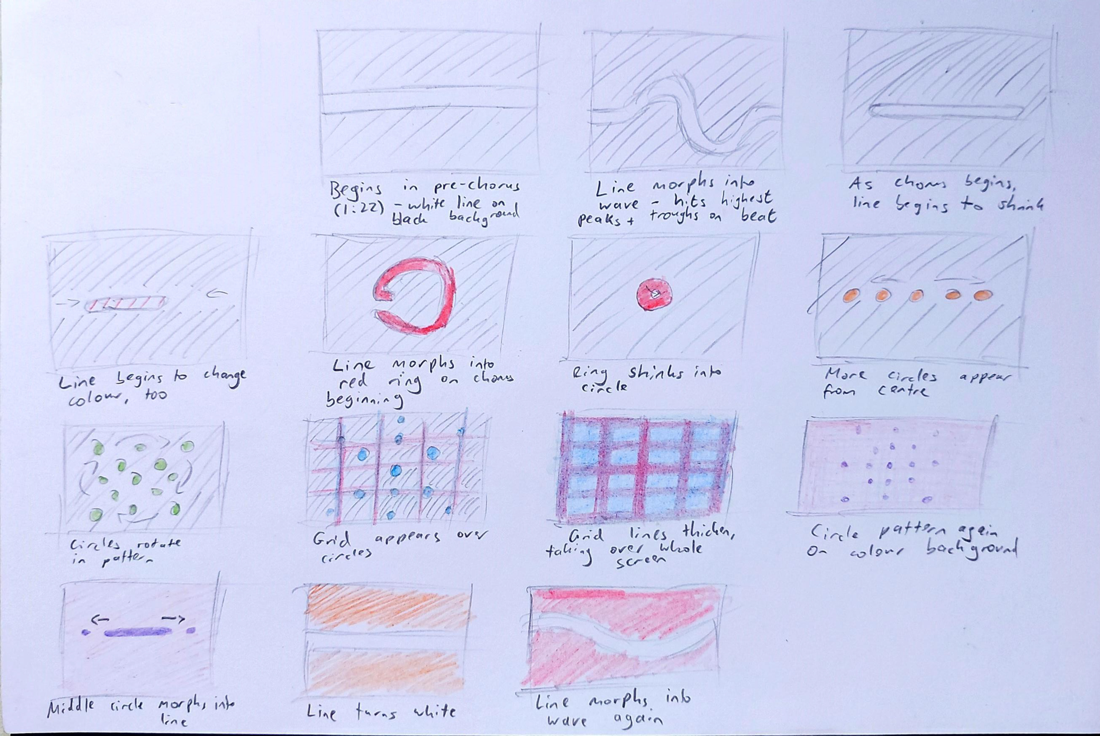
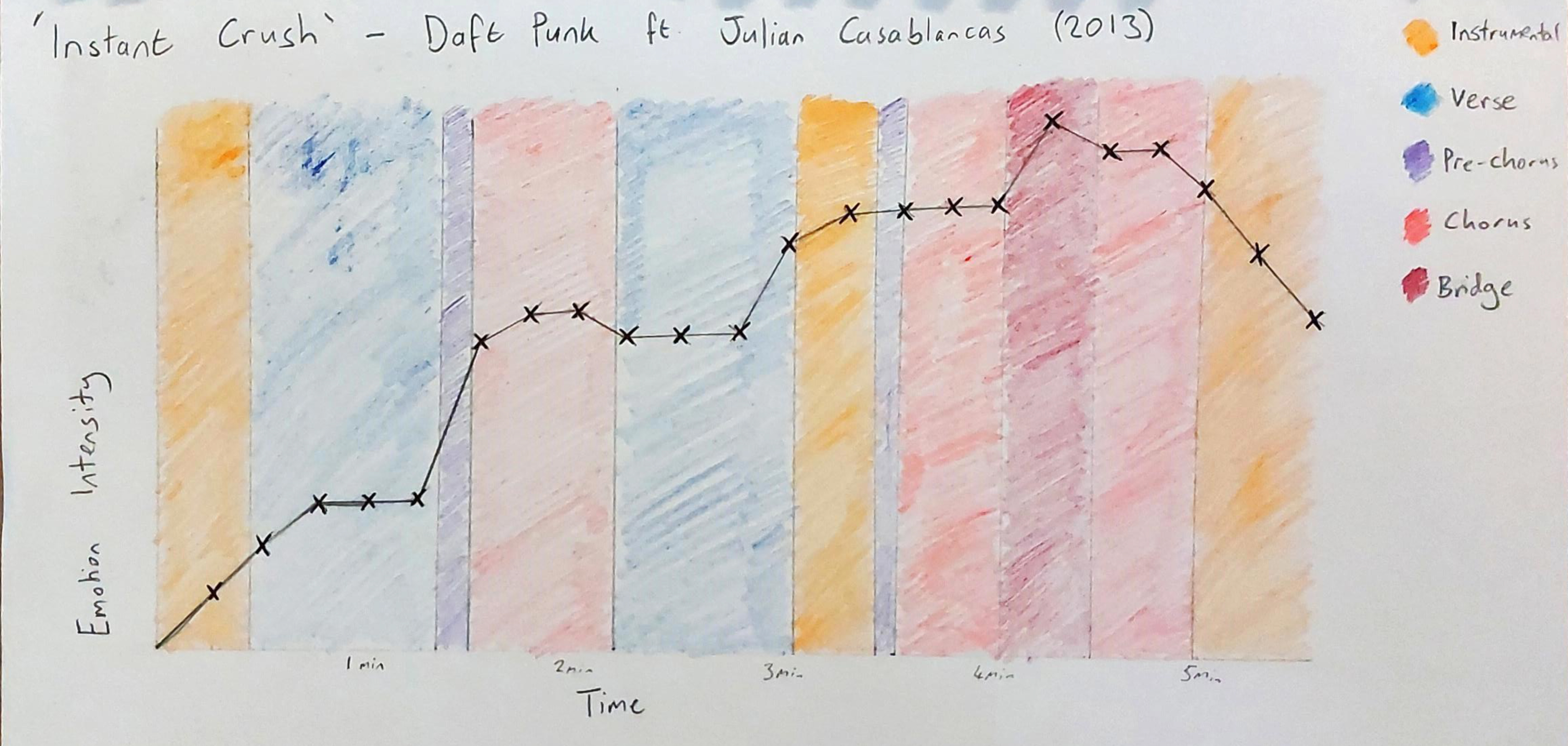
I chose this song, as there is a wide range of emotional intensity throughout, and I thought representing a stark contrast between the slower verse and somewhat more chaotic chorus would be effective. The addition and rapid changing of colour in the chorus mirrors the sudden bursts of energy conveyed through the music as more instruments are added to the composition and it becomes “busier”. The same is true for the shapes I used: originally a singular line moving like a waveform, but as the chorus begins, it morphs into a circle, which turns into a series of moving patterns.
I began the process by plotting the intensity of emotion throughout the song on a graph, so that I could better understand which sections had to be busier.
I also storyboarded the chorus segment to get an idea of what I wanted to happen on screen as the energy of the song increased.